Inspired by similar graphs created by Andrei Frumusanu when he was at Anandtech, I have re-plotted Notebookcheck's performance, power, and efficiency data for the Cinebench R24 Single Thread (ST) and Multi-thread (MT) and Cyberpunk 2077 1080p ultra benchmarks as x-y bubble graphs with the y-axis as chip performance and multiple choices of x-axis and bubble sizes.
Notebookcheck's Performance, Power, and Efficiency Bar Charts
Notebookcheck plots their data as bar charts separately plotting performance, power, and efficiency. Such bar graphs allow for a large number of processors to be compared without clutter and with precise absolute and relative metrics within a chart. But this visual format can make can it difficult to compare processors across charts and intuitively understand their relative combined performance, power, and efficiency characteristics all at once. Example:
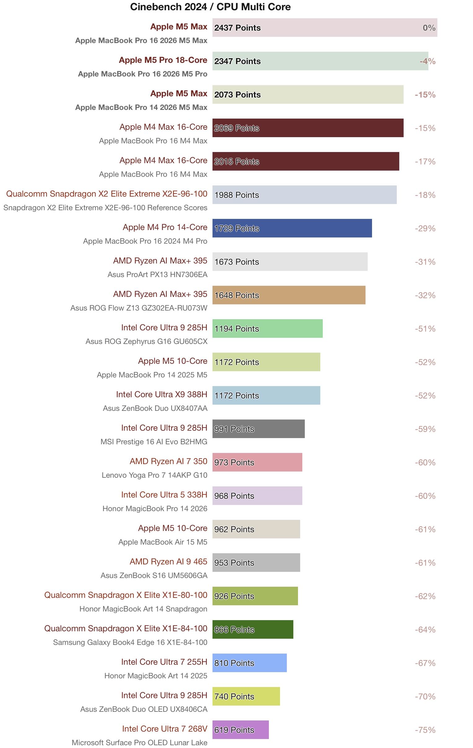
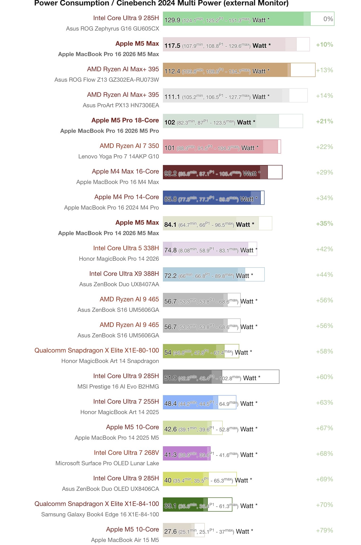
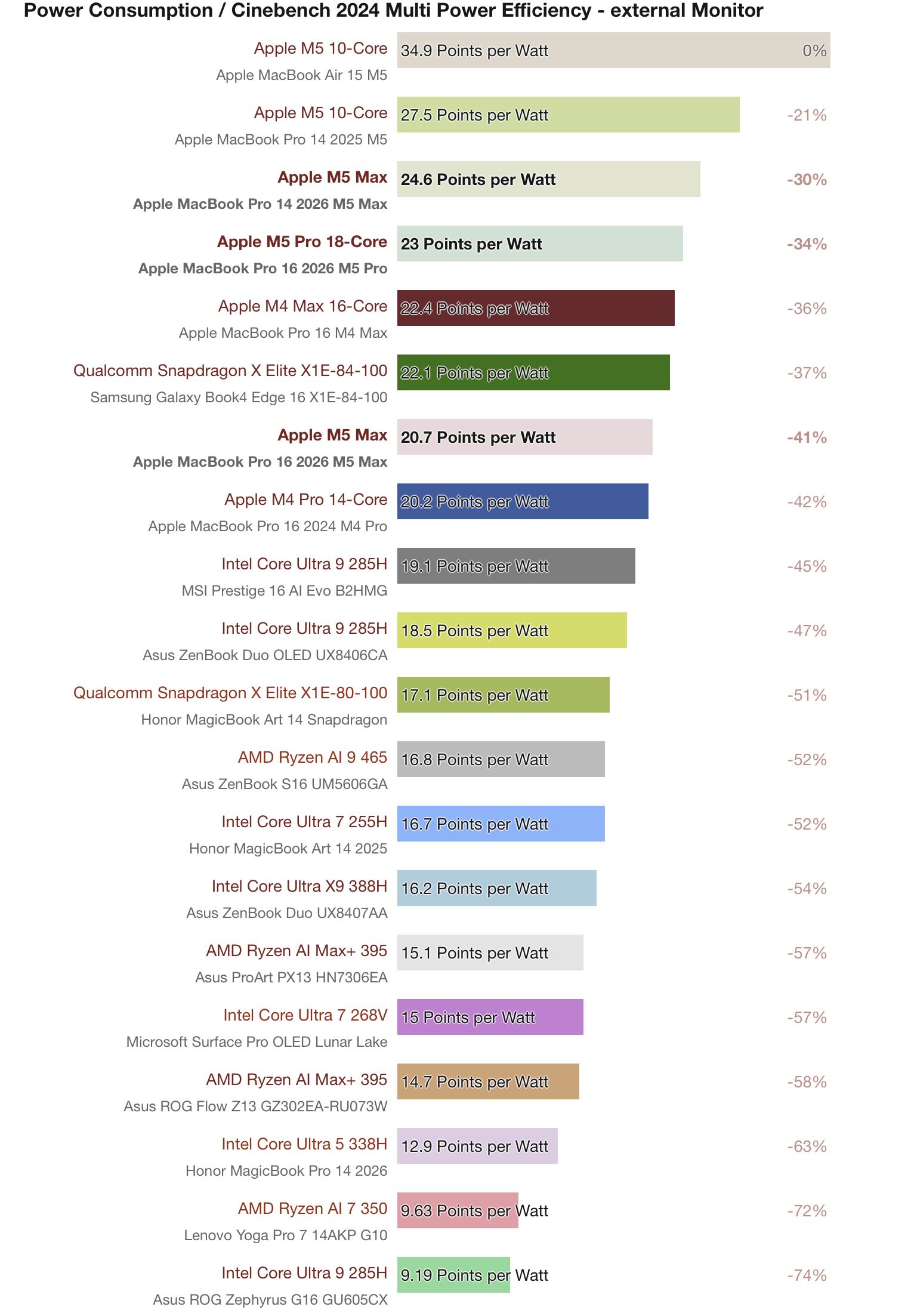
One CPU can be extremely efficient at low power and low performance, while another can have the same efficiency but with higher power and performance - or conversely two CPUs may share the same performance level, but require different levels of power to reach that performance level resulting in very different efficiencies. For instance, the Apple M5 and Apple M5 Pro in the MacBook Pros have similar efficiencies (27.5 Points per Watt vs 23 Points per Watt respectively) but drastically different performance (1172 Points vs 2347 Points) and power (42.6 Watt vs 102 Watt). Similarly, compare the power and efficiency of the Apple M5 in the MacBook Pro with the Intel Core Ultra X9 388H which have the exact same performance (1172 Points), but the Intel chip requires ~1.75x more power to get it. However, one cannot gain an immediate, visual understanding of such relationships when using the above bar charts and certainly not amongst multiple processors all together.
Interactive Bubble Graphs
Mapping power, performance, and efficiency spatially captures how the processors relate to each other more fully. With power on the x-axis and performance on the y-axis, we can plot efficiency as the size of the bubble. However, with a large number of data points some clustered tightly together and other spread far apart, it can be more cluttered than the bar charts and thus difficult to make out individual processors. This is where an interactive plot comes in.
Let's start with the interactive legend where clicking on any legend item or legend title will remove the associated data point(s) while double clicking will remove every other data point(s) but the one double-clicked. Further, one can zoom into different areas of the plot, highlight plot areas, and hover over each data point and get more information on that processor and device. These tools allow one to declutter the graph and to focus on what one is most interested in. In addition, the plots can also give the choice of multiple x-axis and bubble sizes, providing multiple ways to interrogate the processors' characteristics and performance - e.g. instead of plotting power v performance with efficiency as the bubble size, one can plot efficiency v performance with power as the bubble size or choose a constant bubble size for a cleaner, less cluttered view of the graph.
A Note on Power
In addition to the separate graphs for the three benchmarks, Cinebench R24 ST/MT and Cyberpunk ultra efficiency, I have also created separate graphs for different power metrics: Power = Load - Idle and Power = Load. Subtracting out idle power makes comparing processors in very different devices with different idle powers easier and focuses on the delta between when the chip is doing nothing and when the chip is under load. But if the two processors themselves have different idle power draws, such differences will be removed. Comparing load power without subtracting out idle is useful when the two processors share the same setup (i.e. a controlled test bench) and so can capture differences in a processors' idle power draws as well or when one is more interested in the devices' efficiencies as a whole rather than just the processors'.
A Note on Processor Size
Since we have interactive graphs, I thought it might be fun to add another choice of x-axis and bubble size: processor size. While efficiency is performance divided by power, processor size adds a truly independent metric thus providing some additional insight to the power and performance metrics. For instance: all else being equal, in a MT or GPU benchmark, a larger processor with more potential throughput is likely to outperform a smaller processor at the same power. Conversely in a ST benchmark, a smaller CPU is likely to be more efficient than a larger one for the same performance, again all else being equal.
Unfortunately, there is no universal best way to measure CPU/GPU size that has no caveats. Probably the best way would be to measure the silicon die area for each processor. However, I don't have that data for all of these processors and even silicon die area has potential pitfalls: different manufacturing nodes naturally produce chips of different sizes with different transistor densities and not all tests stress all function blocks but those blocks would still contribute to processor size - e.g. CP 2077 is a raster-only test so function blocks for ray tracing and AI would not be useful, but would still be present in silicon inflating the GPU size relative to one that lacked such function blocks.
As such, I use proxies to estimate CPU and GPU sizes - or more accurately to give an estimate of the multi-threaded throughput the CPU/GPU was designed to have. For GPUs, it is simply the number of FP32 units while for CPUs I came up with a rough heuristic to estimate the Effective number of Performance-core threads a CPU possesses:
SMT equals 1.25 for SMT2/HT cores as SMT often gives a roughly 25% boost to highly parallel MT tasks - though it can be higher or lower depending on the task/processor (see studies done by Anandtech [archived] and Tom's hardware).
E-cores will be noted in the hover text and counted towards the full thread count but only count in the above equation if the E-core participates in MT, which, for example, Arrow Lake and Meteor Lake (LP-)E-cores do not.
While each vendor has its own nomenclature for each class of core, I try to be consistent and use the same classification for each company's products:
| Company | P-cores | C-cores | M-cores | E-cores |
|---|---|---|---|---|
| AMD | ZenX | ZenXc | - | - |
| Apple | Performance* Super** |
- | Performance** | Efficiency |
| Intel | Performance | - | Efficiency | LP-Efficiency |
| Qualcomm | Prime | - | Performance | - |
| *pre-M5 Pro/Max, P-cores were called Performance cores **starting with the M5 Pro/Max, Apple renamed P-cores Super cores, introduced new M-cores now called Performance cores |
||||
Again, this is to give a sense of the size of the chip and the level of multithreaded throughput it is designed to have. Obviously different M-cores and E-cores across different companies and generations will have different performance relationships to the P-cores found in their respective processors (e.g. Apple's M-cores in the M5 Max are roughly 70% (CBR24)- 80% (CBR23) of the MT throughput of the P-core). Further, smaller cores often shrink faster in silicon than their reduction in multithreaded throughput might suggest and of course different core designs across generations and manufacturers will vary in size so this will only have a very loose relationship to a CPU's silicon die area. Similarly, different GPUs utilize their FP32 units in different ways and achieve different levels of compaction with them in silicon. These sizes are thus meant to be rough approximations for MT throughput potential independent of clock speed - the latter of which is accounted for (indirectly) when measuring a chip's power under load(-idle). And for some chips in some benchmarks, the graphs plot the performance of the same processor in the same device measured at different clock speeds/power draws which gives an especially nice view into how power, processor size, and performance all interact for that processor.
Additional Notes
- When viewing this website on mobile, use the links below to launch a plot in a new window. On the computer (and wide enough tablet screens), you can both launch a plot in a new window and see it rendered below.
- Plots are best viewed on a computer where a mouse can hover over data points for more information (on touchscreen devices longpress and release to activate hovertext without activating semi-permanent marker labels). Within the plot, you can click the data points to permanently add annotations for that data point (the form factor of the tested device and notes, if any). Click again to remove. Hint: data points are easiest to click in constant bubble mode.
- There are further plot controls in a "mod bar" in the top right corner to download an image of the plot, zoom in or pan across the plot, select data points to highlight on the plot, draw on the plot, etc ... It appears when you hover over the graph.
- When zooming in on the plot, to reset the axes, double click an axis to reset that axes, or the white part of the plot to reset the whole plot (or hit autoscale in the top right hand corner, which does not fit all available points but resets axes back to default). When returning to an axis that previously had a zoom applied to it, that zoom will still be there even if you reset the plot. Simply reset the plot again.
- The static legend is nice for when downloading a png picture of the plot.
- For the Cinebench R24 ST Power = load graph, I cut off the desktop chips for x-axis = power because they are completely dominated by idle power (75-90W), so those data points only make sense when subtracting out idle power (at least in comparison to all the other data points). You can still reach them by panning the graph or zooming out. Again, autoscale has been set to reset the axes back to the original ranges, not to fit all available data points.
- For CP2077 1080p Ultra tests on Notebookcheck, the efficiency FPS results are not the same as the standard FPS results. The efficiency test seems to be run with a 30 minute start time that often has its own FPS chart in a device review (except for Macs, you have to go to their analysis articles or chip pages to get them). This means they often (though not always!) have lower reported FPS than in the standard GPU results charts.